Menu


I worked with Nicole Thornton, Owner and Director of 5678 Dance, to rebrand the business. When Nicole reached out to me about rebranding and creating a custom website, I was beyond excited. I grew up at 5678 Dance. When she bought the studio, she made it her own while keeping all the values and attributes that made the studio such an amazing place to grow up.
Visit WebsiteOver the summer, I worked with Nicole Thornton, Owner and Director of 5678 Dance, to rebrand the business. When Nicole reached out to me about rebranding and creating a custom website, I was beyond excited. I grew up at 5678 Dance. I was there more than I was at home. The teachers practically raised me and my teammates were my sisters. After I graduated, Nicole, my childhood babysitter and role model, returned to the studio after dancing and acting professionally for many years. When she bought the studio, she made it her own while keeping all the values and attributes that made the studio such an amazing place to grow up.
When I began researching and designing for the new brand identity, I knew the new brandmark, accompanying colors, and graphics needed to show the everyone else what I know, my friends know, and the current dancers and families know 5678 dance to be: a home away from home. These are the final results!
When I began researching and designing for the new brand identity, I knew the new brandmark, accompanying colors, and graphics needed to show the everyone else what I know, my friends know, and the current dancers and families know 5678 dance to be: a home away from home.
Entering into fall 2020, the studio is starting their 28th season. For the people who know 5678 Dance, their reputation as a professionally run, family oriented studio is strong. However, they needed a brand identity and website to show other community members without having to step foot into the studio.
The ultimate goal of the project was to reach more families in the community with young kids and encourage them to sign up for a class or 7.
Process is important in reaching meaningful solutions. My goal was to find who 5678 Dance was to their team and the public and to find out what they needed to do to stand out.
I first began with a discovery phase. I began by conducted a marketing audit by collecting evidence of how the studio has presented itself over the past few years. This included current designs, social media posts, website pages, programs, flyers, etc. I was then able to point out the inconsistencies and varying messages.


After completely understanding where the studio stands, I began looking into what the competition was doing. After looking at other dance studios in the area including studios the owner and teacher identified as competition, I found some trends. In terms of messaging, studios seem to go in one of two directions: one, they focus on creating a fun, family-friendly environment for their students, it’s more about developing character than becoming a professional dancer. Two, they are focused on craft and have opportunities to lead dancers to a professional career while also making their experiences enjoyable. When organizing the logos of competing studios, I was able to fit them into three different categories: stock icons/silhouettes of dancer with name of studio, typography based, and other/multiple performing arts icons. 5678 dance fit into the first, most popular category of a stock silhouette of a dancer with the name of the studio.

I also interviewed the owner, staff, and customers, to find out what 5678 Dance's brand already was. I removed myself from everything I already knew about the studio, and listened to what everyone else had to say about 5678 Dance.
By the end of the process I was able to make conclusions and create a brand brief to reference throughout the rest of the process. The biggest insight was that 5678 Dance was not the only studio in the area that claimed to be family-friendly with quality instruction (said in various ways). We decided it was crucial to keep these qualities but I knew we needed to dig deeper.
Core Purpose We exist to provide a warm, loving environment for children to have fun and positive experiences learning to dance and perform. Our family-friendly environment is one that students can come back to their whole lives.
Positioning Our child-centered approach focuses on providing exciting experiences for our students through quality instruction in a warm, welcoming home away from home.
Respectful We respect ourselves, our faculty, our craft, the children we teach, and their parents
Lighthearted Showing children how fun the performing arts are by keeping the atmosphere light and engaging
Experienced Knowledgeable and professional in class, at performances, and in conversation
Loving Warm and welcoming attitudes to make every child feel valued
Finally, I began to devise a big idea from the research and insights. I found this quote on a Habitat for Humanity website "Definition of Home" contest.
"Home means an enjoyable, happy place where you can live, laugh and learn. It’s somewhere where you are loved, respected, and cared for. When you look at it from the outside, home is just a house. A building. Maybe a yard. But on the inside, it’s a lot more than wood and bricks. The saying ‘Home is where the heart is’ says it all ... Home is also where your memories lie ... [and] where your hopes and dreams are.” Wynn

Welcome Home!
After Nicole approved the brand brief, I moved on to designing two directions for her to choose from. I knew the new brandmark, accompanying colors, and graphics needed to show the everyone else what I know, my friends know, and the current dancers know 5678 dance to be: a home away from home. I explored both typographic and image based brand marks.
To stay away from silhouettes of dancers, I focused on the idea of ribbons. Ribbons are used for costumes and shoes for dancer performers, and musical or acting performers. Ribbons also represent being tied together. I presented Nicole with a set of two ribbons intertwined together as if they were around an ankle. I used the light blue previously used with a dark blue, pink and burgundy.


The next direction I presented was a typography based logo using the 5678 characters. The ends of the letters appear to weave in and out of each other as if children are linking arms or embracing. This option was presented with two different color palettes. One kept the light blue and black the studio was using at the time, while the other integrated more colors to feel more playful.


Nicole chose to move forward with the typographic logo using the four vibrant colors. I began working with what I had already created to develop a system to apply to the website, print material, merchandise, social media, and anything else that might come up.
The new logo shows the love and connections that makes the dance studio a home for their students. The intertwining numbers mimic the linked arms of the best friends and families that make up the 5678 Dance community. The bright colors and gradient create a fun, exciting, child-like vibe that embodies the studio’s atmosphere.

I wanted to use colors that were fun and exciting while also including the light blue they previously used. Adding in a peach, darker blue and yellow, brought in some extra excitement.

The typography needed to be professional, but not stiff. For the main logo and later show title, we chose Didoni URW as an elegant, but modern serif. Google’s Spartan is a simple, warm geometric sans-serif. Used for the majority of the studio’s written content, Spartan offers a variety of weights. For best contrast and legibility, we use light and Extra Bold weights most often.


Combining the four colors into a gradient creates movement within the system. Shapes dance from one color to the next in the ever changing gradients. To top it off, white sparkles can be added over the gradient or a black background to bring the compositions to life. Plus, what performer doesn’t love some sparkles. (As a performer all my life and an adamant hater of every pink fluffy costume I had to wear, I can say that there’s nothing like some good sparkles to brighten your day.)


Results By the end of the process, I wanted to set Nicole up for success. I wanted her to be able to uphold the new brand and create clean graphics for social media, flyers, etc. without me. I created templates for her on programs she was familiar with such as Word and Canva. A week or so after I sent her the deliverables, I visited the studio and was amazed at the signs she had made around the studio and on the door using the templates, colors and elements of the new brand identity!
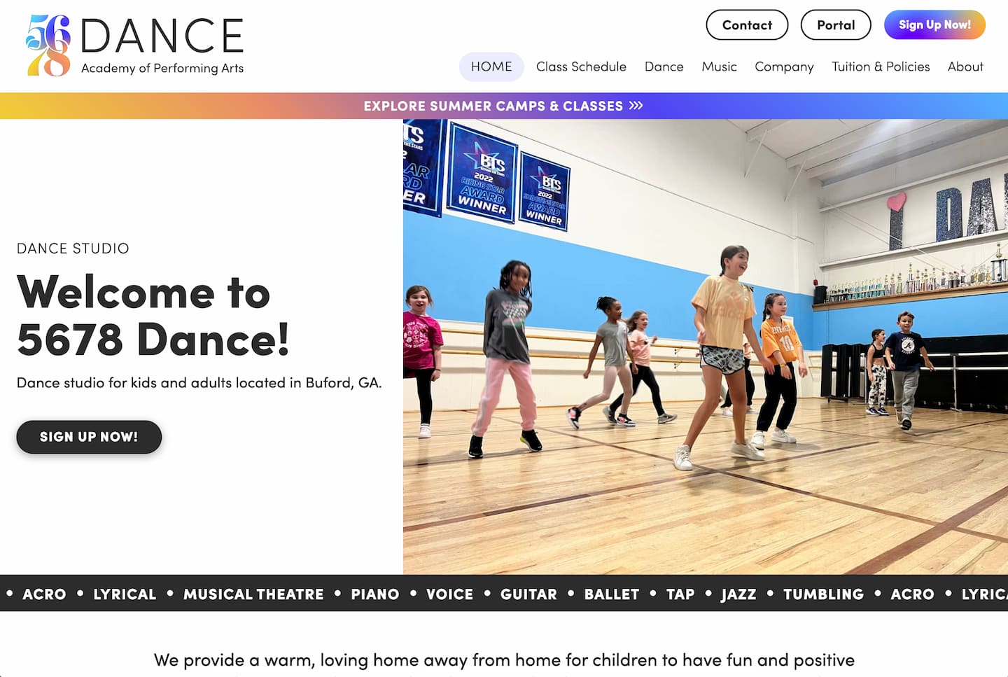
After completing the branding process, with 5678 Dance owner Nicole Thornton, we moved on to designing and developing a website. With the target audiences in mind, parents of young children, I focused on two main challenges. First, between work, children, and more, the parents of students are busy. Difficulty accessing important information will likely turn parents away. Second, with COVID-19 at the forefront of everyone's minds, parents need to be assured that it is safe to bring their children to the dance studio.
The goal of the website was to be fun and professional. The challenge was to include all of the necessary information using as little text as possible.
5678 Dance’s primary audience is busy parents of young children. Therefore, our goal was to make the website concise and professional, yet fun and interesting for the children looking over their parents' shoulders. Set-up for success with the bright colors and fun graphics of the brand, our main focus for the website was content and clear presentation of that content.
As a dance studio, Nicole's success revolves around participation. With COVID-19 at the front of everyone's mind, we wanted to make sure that parents felt comfortable bringing their children to the studio. After all, Nicole had plans set in to place and a long list of precautions she was already taking to keep the kids and their families safe while still being able to come dance in person.
I follow a three phase process for designing and developing websites for clients. After meeting to discuss goals and Nicole’s vision for the website, I created a site plan. Once the site plan was approved, I designed the website. Finally, I developed the website, tested, edited, and launched.
First, I began to lay out the pages of the website. We wanted to minimize the number of pages but also be sure to not include too much information on each page.
After deciding on the page structure, I created a content outline for Nicole to help fill out. Though I am not a copywriter by trade, working with journalist for years in print taught me much about cutting out fluff and getting straight to the point. I started by copying and pasting the existing website, shown below, content into the outline. Then, after cutting repeated section, I simplified the writing to include the necessary and decided on images that would illustrate what was written.
Following the approval of my designs, I began to build the website. I built fully responsive pages that looked good and functioned well on all devices. Once the site was built, I set up an Editor account for Nicole to be able to change, add, and take away content without changing the design. After a 10 minute Zoom call, Nicole had learned the ropes and was ready to make edits on her own.
I used the new brand guidelines to design a website that would look fun for kids and be professional for the adults.
Using photographs and solid colored sections filling the screen, I eliminated distractions for a quick, fun read. On pages with more written content such as the schedules and policies, I chose to use drop down menus. That way parents can quickly find the age group or category they are looking for with out having to scroll through an endless page of content.

As for the challenge of COVID-19, a colorful badge spins is fixed to the bottom right corner of every page, so parents can quickly access the precautions the studio is taking to keep students and families safe. Photos illustrate each precaution allowing parents to scroll through the page quickly.